Architecture
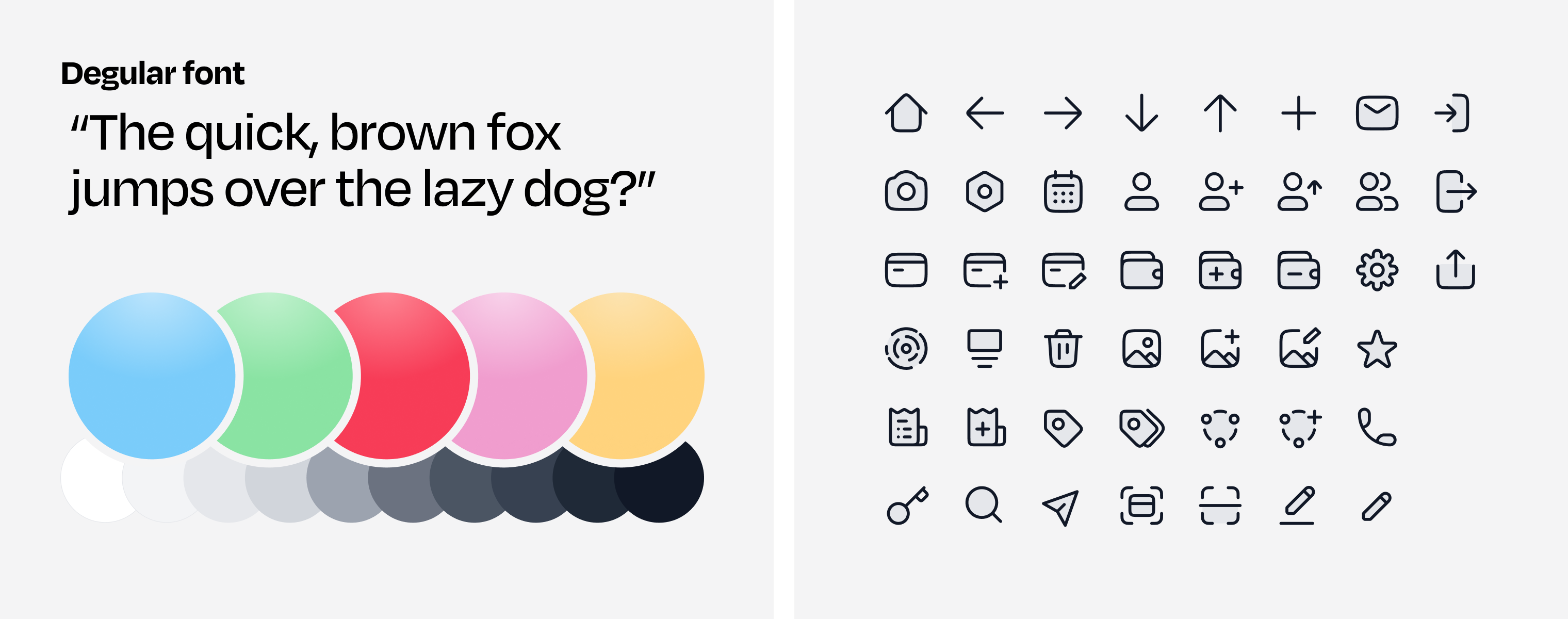
Tone of voice & Look and feel
As Divvy was meant to be used outside the professional setting, it was decided to run away from a sturdy, clean-looking design. I wanted to play with color, and make typography have a more youthful personality than the default iOS fonts. Everything was made bigger than usual and all around the app there are little details to make you smile.
> Playful, informal, dynamic & young
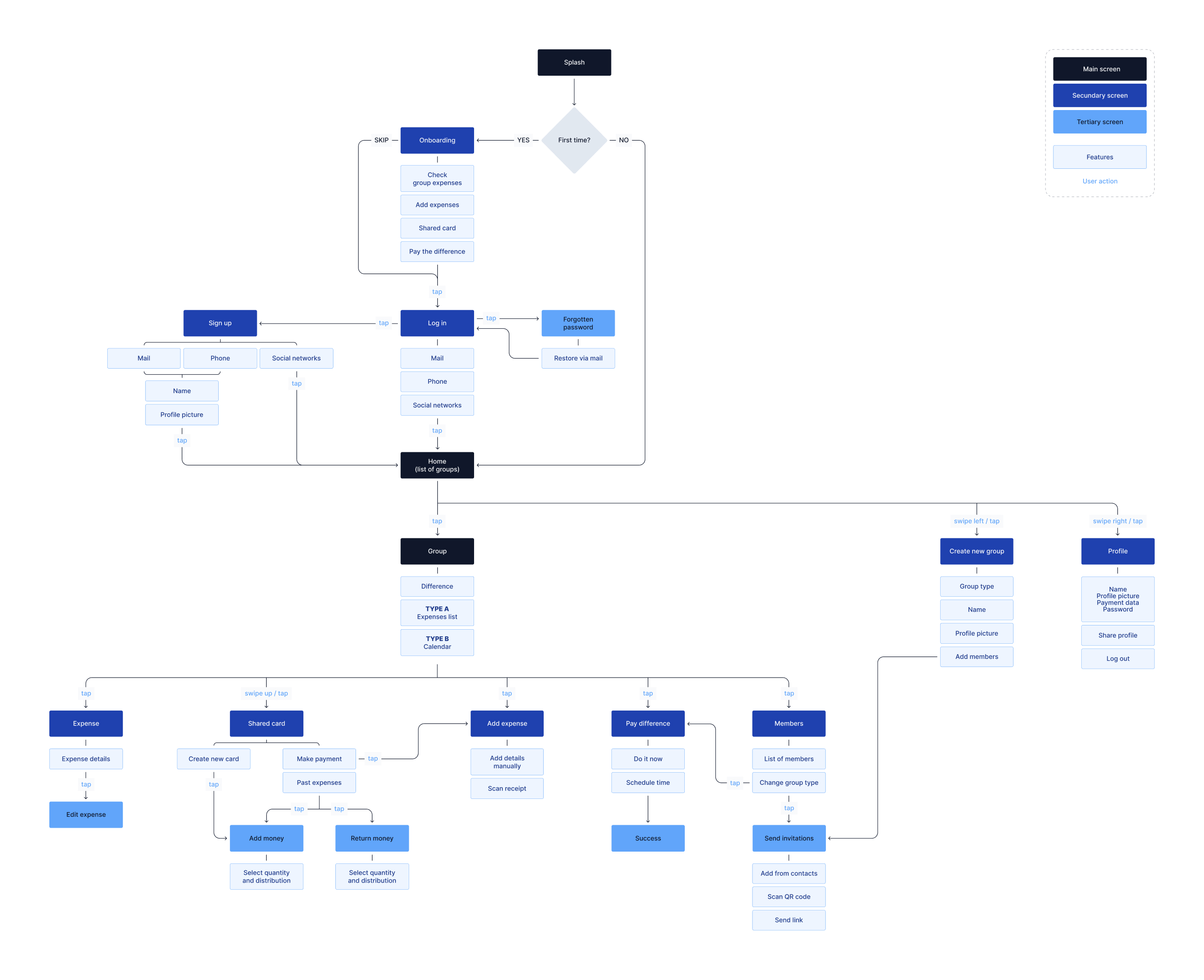
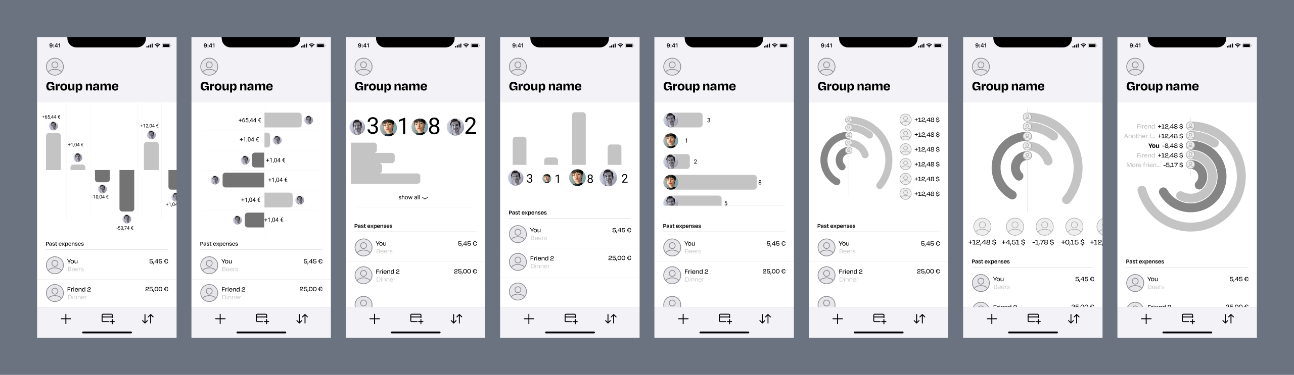
Wireframes
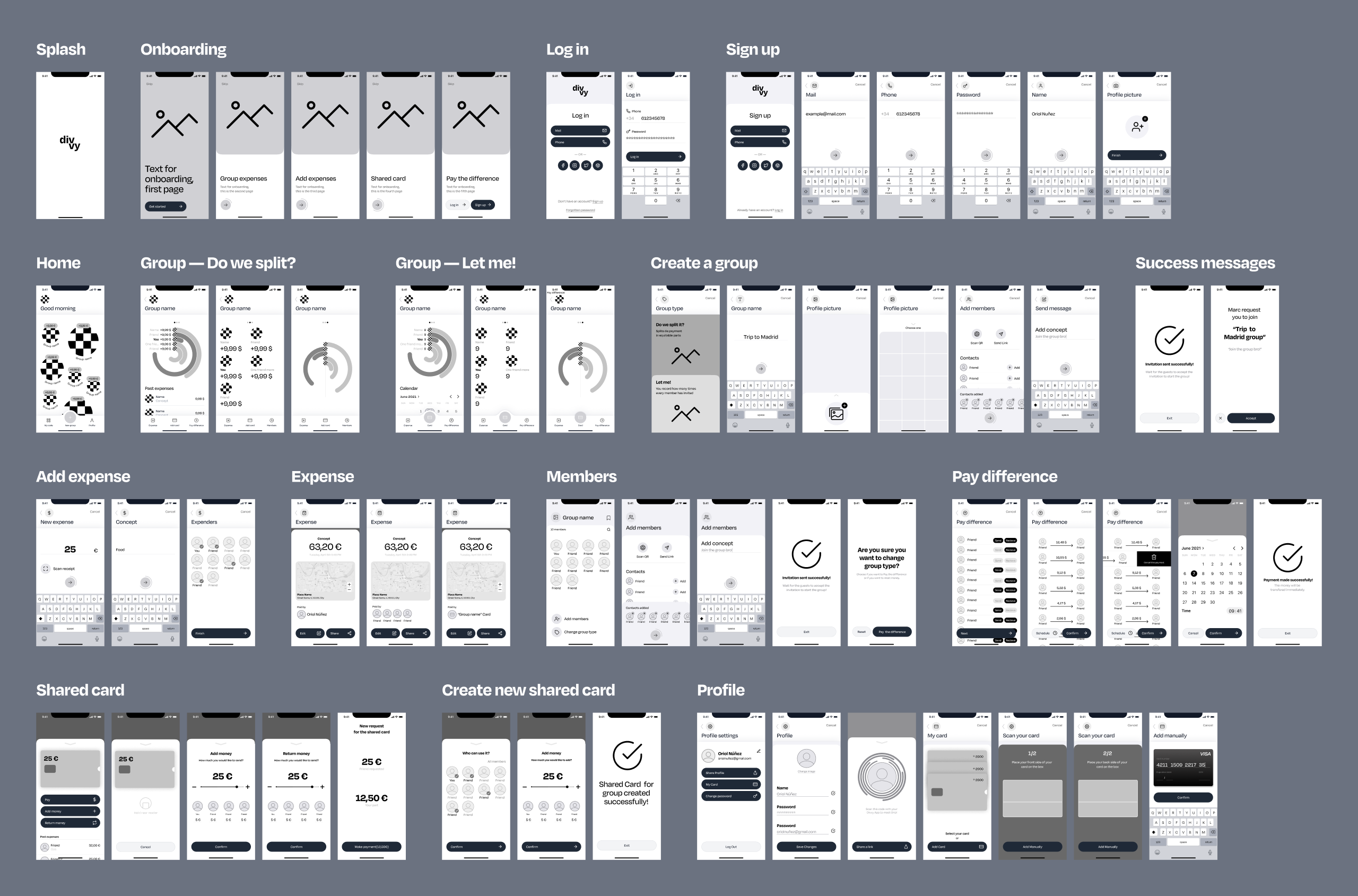
One of the most challenging parts of the app was also the central part of the app: how do I communicate the payment balance in friendly, happy way but that is still intuitive? Many iterations were done on the design, and I ultimately settled on a circular graph.
Identity
A quirky, grotesque typeface; a vibrant palette; and duotone, rounded icons.
Logo
The logo comes from the merging of two people, but it also symbolizes the movement of money. On animation, it flows quickly and directly, mimicking the ease with which money can be moved inside the app.
![]()
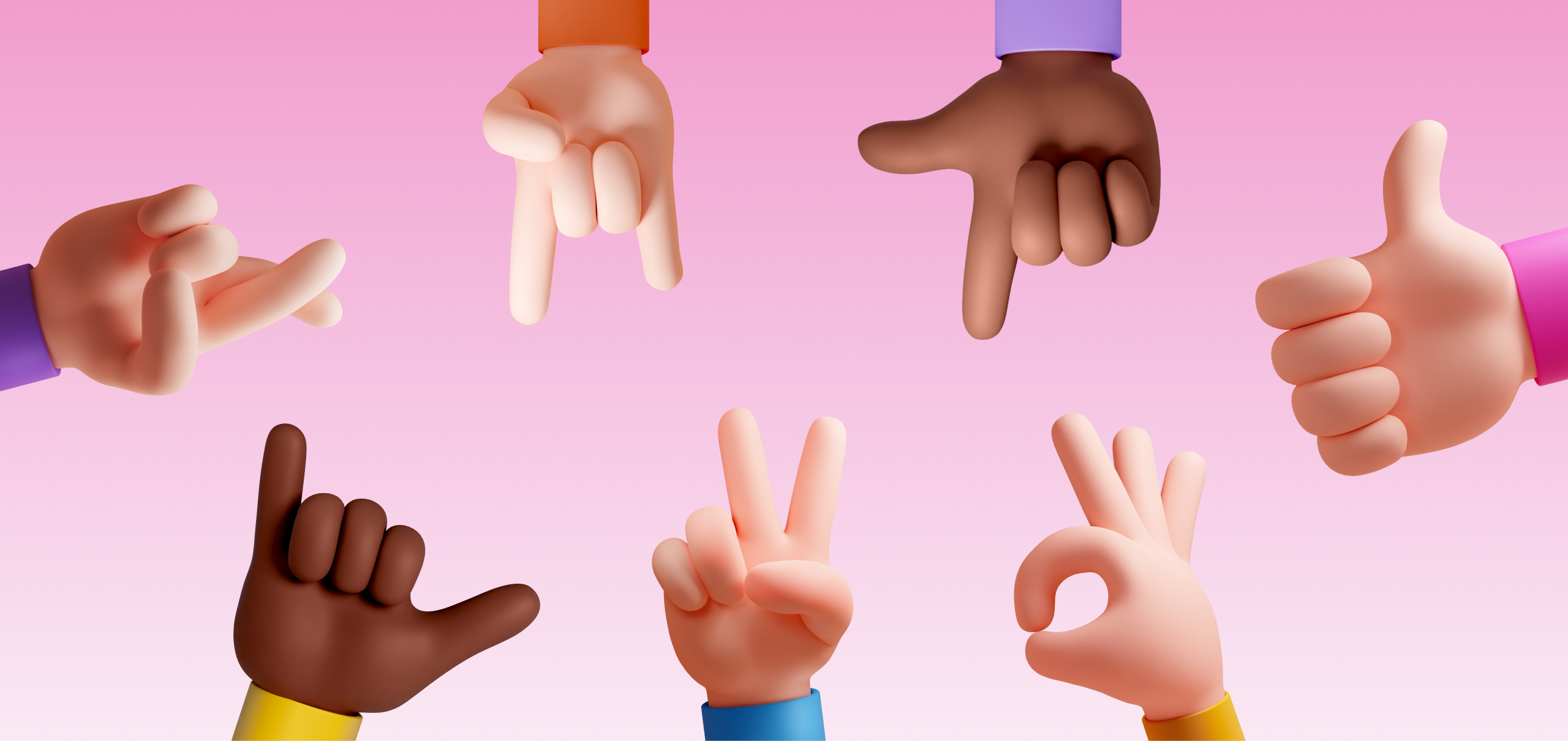
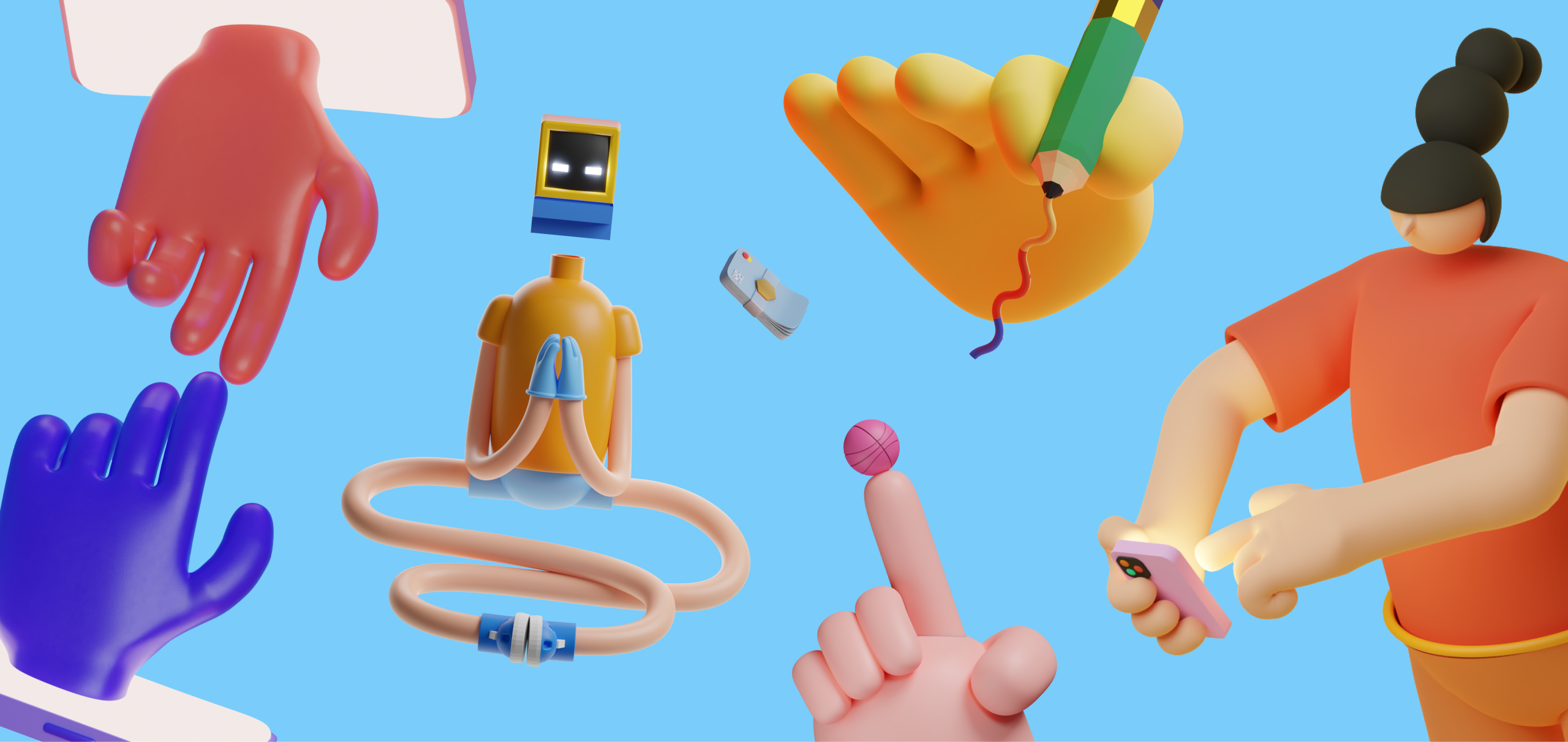
Illustrations
Sporadically, the app features illustrations, which helps on the mission to make the app more friendly. These were sourced from Figma Community.
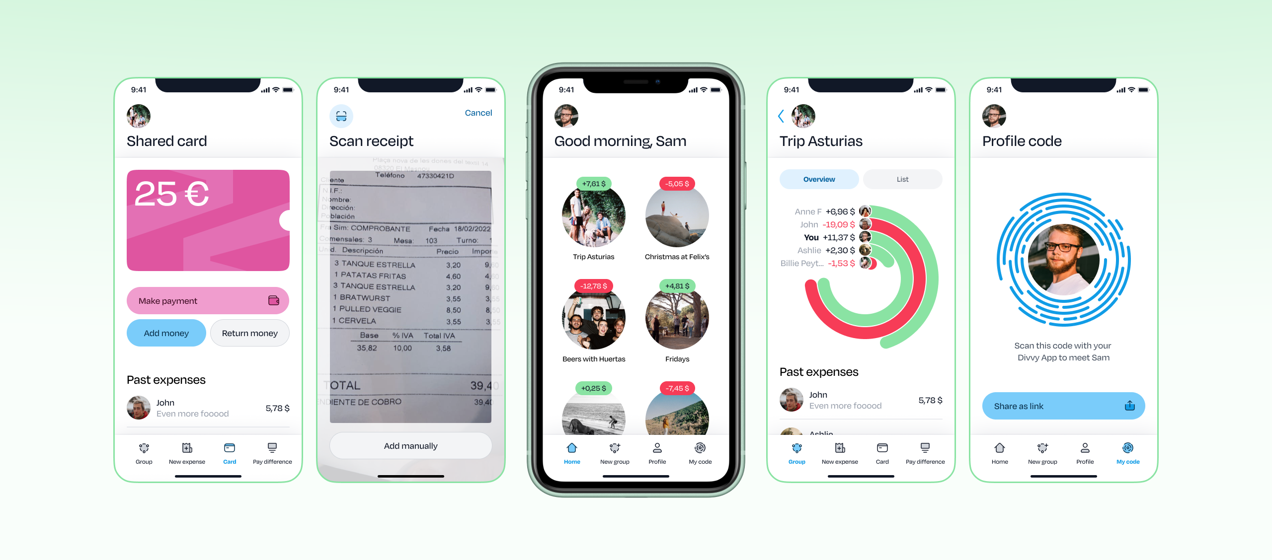
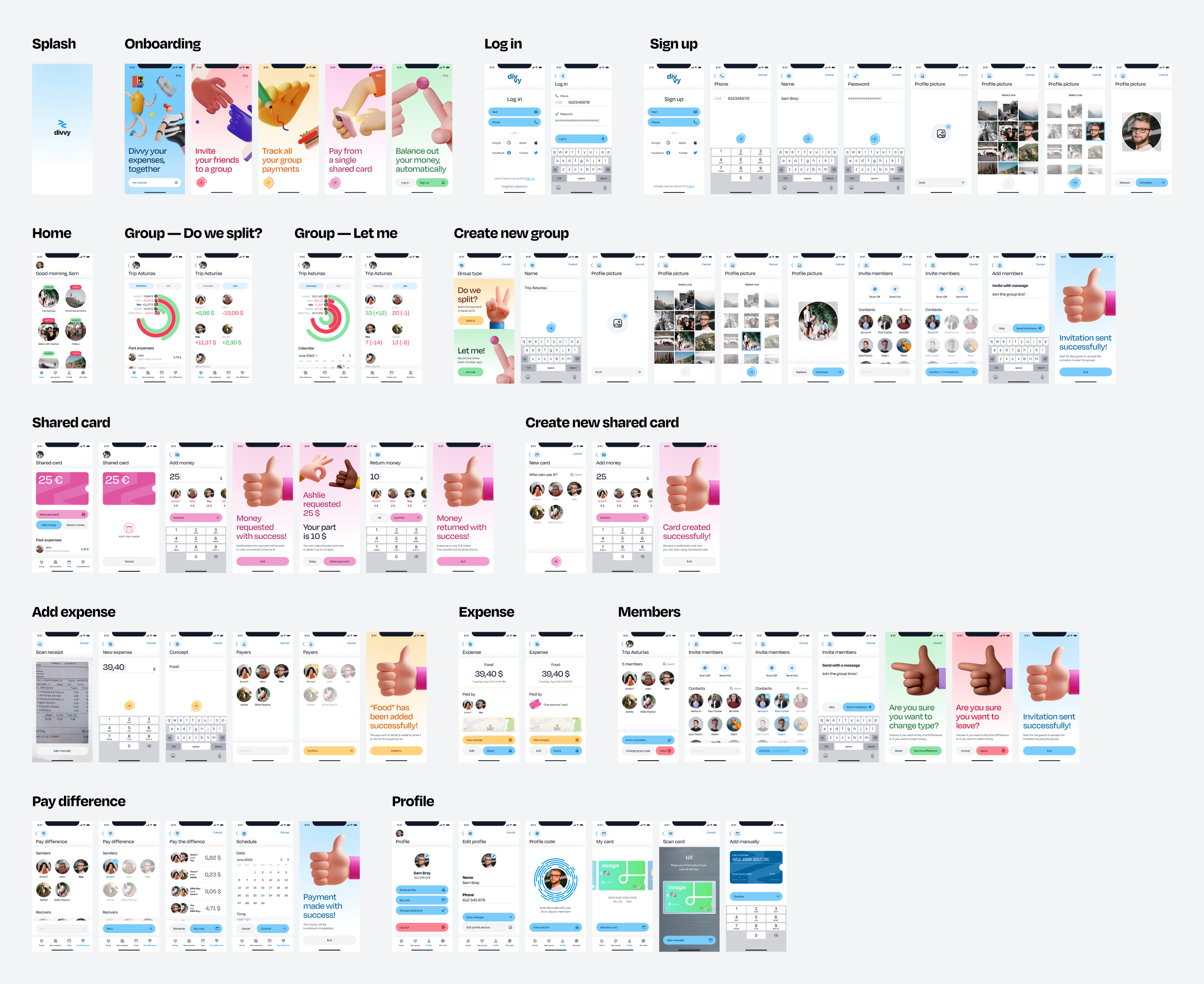
Design result