The unsucessful navigation
The original ITSM service catalog had grown over time and become hard to navigate. Users (especially those with less technical knowledge) struggled to find the services they needed. The structure no longer reflected how users actually searched or thought about the content, which led to frustration and inefficiency.
Goals
User
- Make the structure intuitive, and reduce the time and effort it took to find the correct service.
Business
- Improve user accuracy when selecting services, reducing the need for manual intervention by support agents to recategorize or redirect submitted tickets.
- Set up a coherent structure that would make it easier to analyze the catalog in the future and find services that could be merged, split, removed or added.
Process
Interviews with users to find improvement opportunities
As part of our research initiative, we interviewed users to understand how they felt about the digital platform. These conversations revealed a range of usability issues with the service catalog, including inconsistent categorization and unclear terminology.
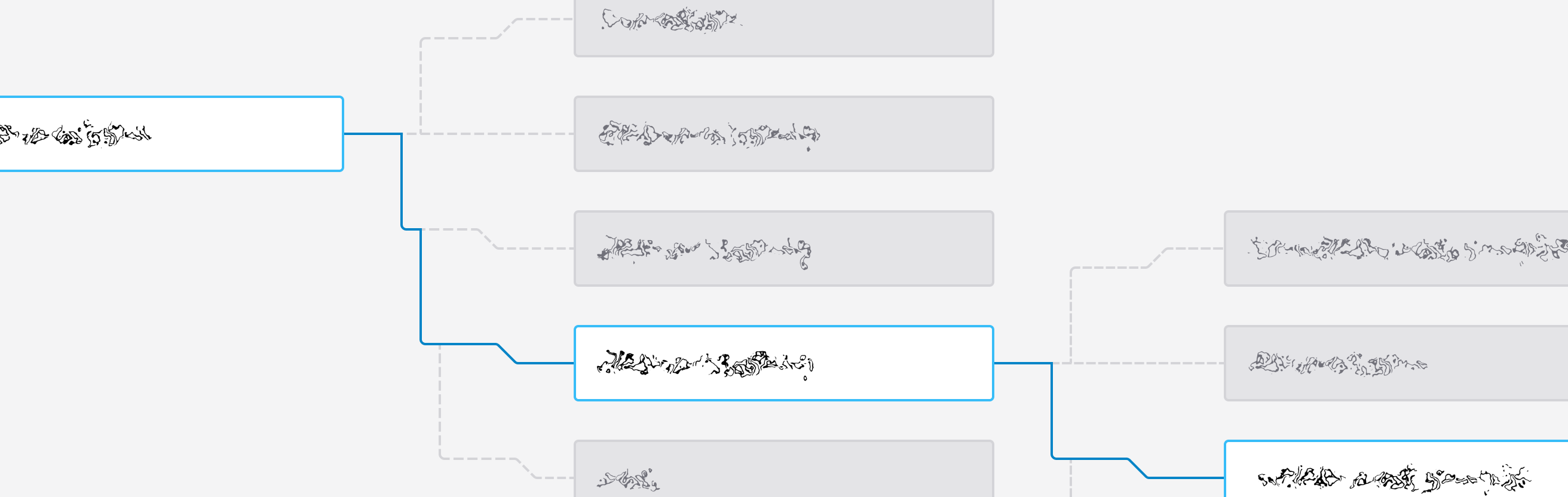
Definition of a more intuitive structure
With these insights, we mapped out a new structure. We defined a hierarchy that made sense even for someone unfamiliar with technical jargon. The updated structure was more logical and consistent, built around how users naturally grouped services in their minds.
Testing to validate assumptions
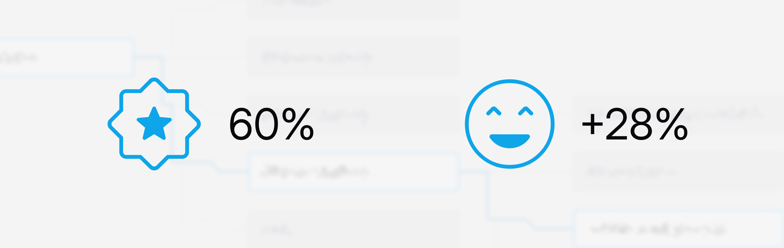
To evaluate how intuitive the new structure was and to identify areas of improvement, I used treejack tests using Optimal Workshop. The initial version had a 60% success rate and user satisfaction increased by 28% compared to the old version.
Iteration to guarantee optimal user experience
We used the test results and user feedback to keep refining the structure through several iterations. Even small changes had a noticeable impact on user success, highlighting the value of continuous iteration based on real feedback.
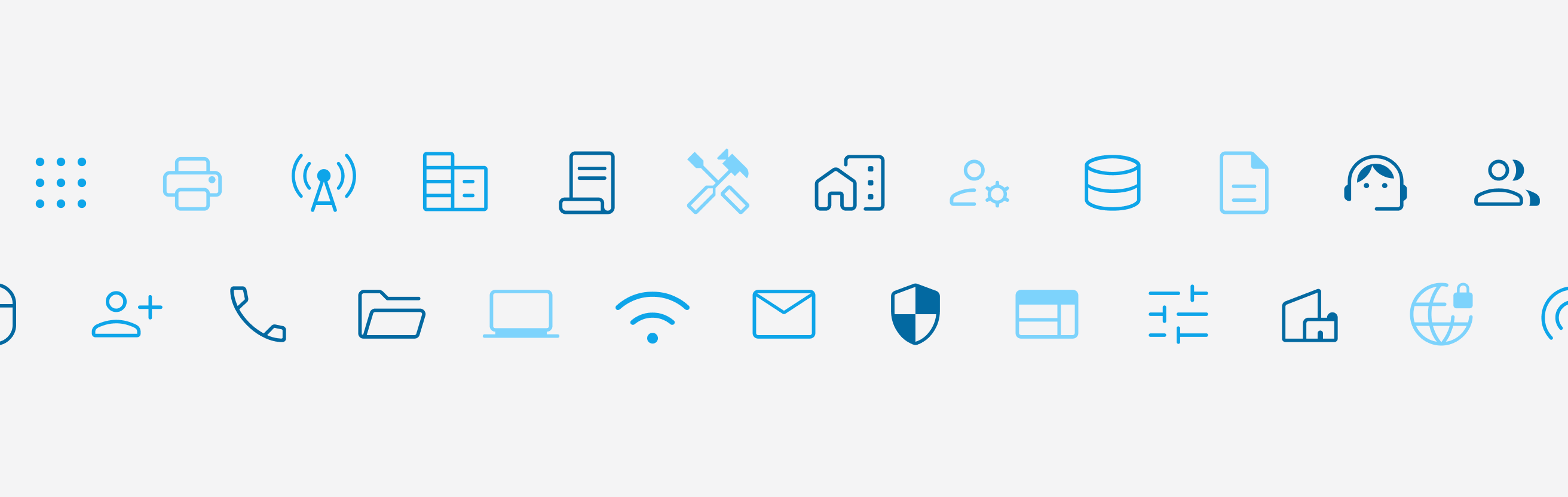
Visual design to improve recognition
To further support navigation, I added icons for each category. These were selected to serve as visual indicators that helped users scan the page. I made sure the icons were distinct, meaningful, and coherent with the brand identity.
Results
The new structure led to a clearer and more enjoyable user experience. Users could navigate the catalog more efficiently and satisfaction scores reflected the difference, with a 28% increase compared to the previous version. The icons made the interface more approachable, and the overall structure better supported the way users think.
The project showed how a few focused changes (backed by research, testing, and iteration) can have a meaningful impact on usability.